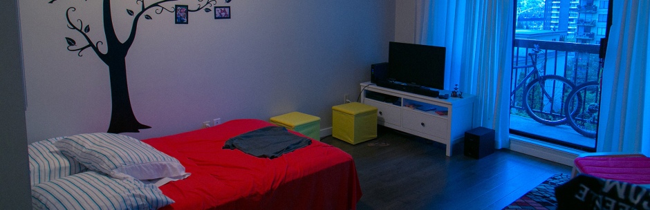
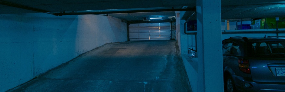
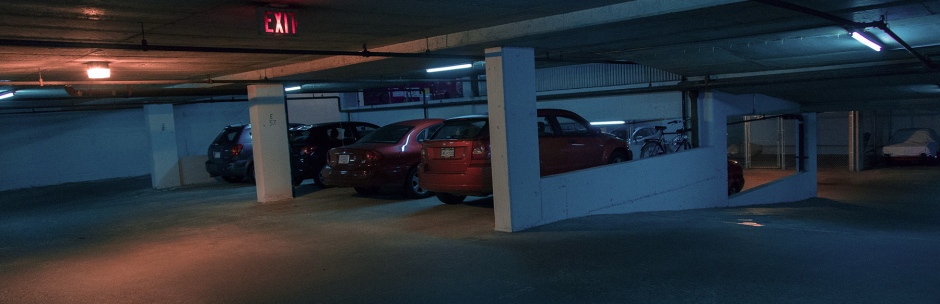
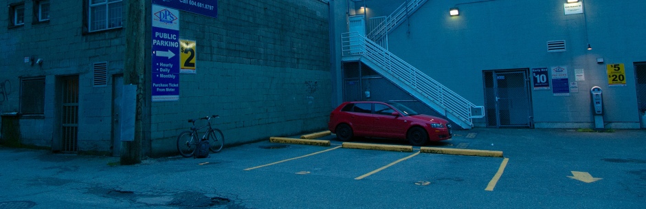
During this week we’ll talk about the role of color on our reels. For such classes I worked on some grading for my current frames, aiming at the look I want on the final product: something that feels colder while keeping skin tones almost natural, just a bit less saturated and still have a nice color to draw attention to things (red, as you’ll see below).
Frames are cropped in a wild aspect ratio just to make it easier to see the colors as a “strip”. I like them this way, but will stick with 16:9 aspect ratio for this project. The garage and exterior are still too cyan when compared to the interior, but my footage couldn’t make it all the way through without looking too weird for this part of the process.
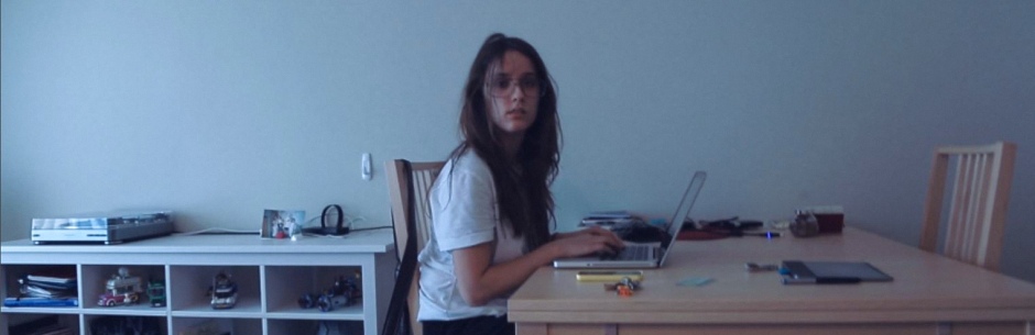
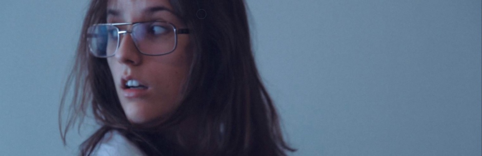
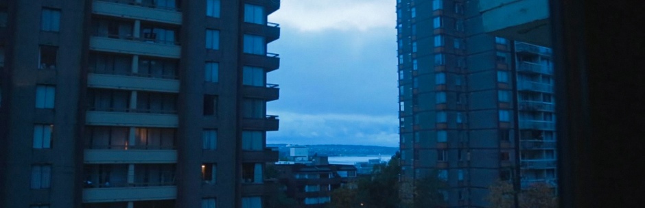
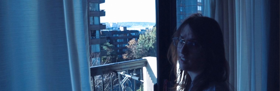
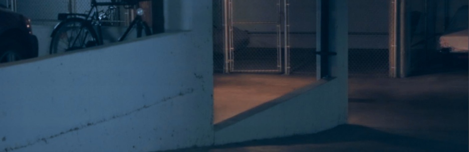
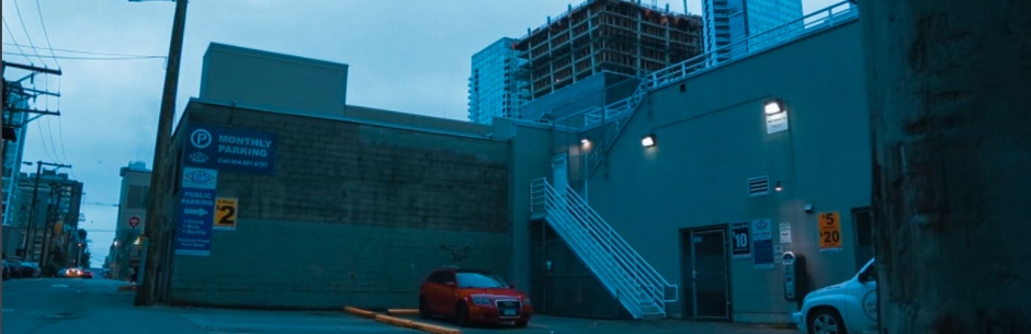
These are slightly different than what I had in the previous presentation, and I’ll have much more room to play with colors and the overall image once I stop shooting H.264 and go RAW. The pictures below shot my locations, as well as how the red color still punches strong through all the blue, which almost calls out to be used in a creatively manner. I’m definitely not missing this chance!